Originally posted 29 July 2009.
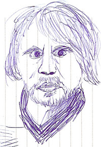
Last night’s class marks the halfway point for this course, and we finally started color. I actually own three sets of pastels, so rather than buying new, I brought them all to see which was the most applicable. This was a fortuitous decision on my part: our teacher specified chalk pastels, but the set I was originally going to bring was oil pastels. So I ended up using my great-grandmother’s set once again.
Our first drawing was of a sunset over mountains. This was strictly a “getting to know you” venture with the pastels, to use a large number of colors and see how they blend. Mine turned out okay, but just okay. After that we completed our “real” task for the night: flowers.
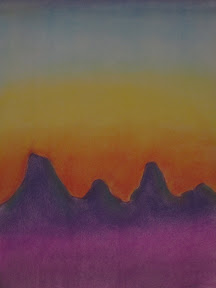
chalk pastels on newsprint
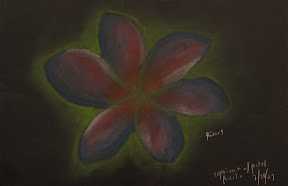
We’d been given an assignment last week to bring in pictures of Georgia O’Keeffe paintings and large-scale images of flowers. I went a little overboard with Google Images and brought somewhere around three dozen pages of print-outs. Turns out to have been a good thing I did: I think I was the only person in the class who remembered to bring in anything. The teacher was unexpectedly grateful when I told him he could keep the pictures. What am I going to do with them? And honestly, I can always just print them out again. Most of my classmates used a picture from the set I brought, so I was doubly pleased to have printed so many.

chalk pastels on newsprint
My sunset was done on my lap, but my flower was on the easel. They both have their benefits and drawbacks. On my lap, the pastel dust more or less stays put without any unintentional smearing, but leaning over the paper is uncomfortable, and I got a lot of pastel on my shirt to boot. The easel was cleaner from a laundry standpoint, but I kept having to blow away the dust as it slid down the paper so I wouldn’t accidentally mix it in the wrong places.
Overall, I think I prefer the easel for large-scale art (we were using the 18″x24″ newsprint pads again). I also discovered an unusual quirk with the easel. See, I am completely right-handed. Indeed, while recovering from carpal tunnel surgery I discovered I am all but helpless with my left hand. But when using a stick medium (chalk, charcoal, pastel, Conte crayon) on an easel, I use whichever hand is most convenient. I didn’t even realize I was doing it at first, but it’s sure (for the lack of a better term) handy.

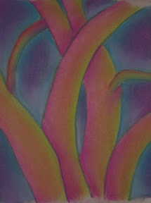
oil pastels on black paper
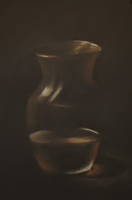
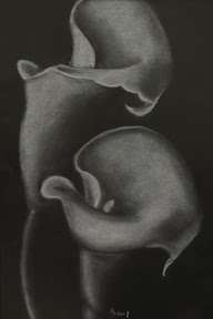
The teacher used my drawing to demonstrate stuff to the class, meaning he completed the first two petals on my flower. This head start meant I finished my drawing long before the rest of the class (or maybe I’m just not as fastidious as they and rush my work, which is just as likely). With the extra time, I experimented with the other pastels I’d brought. I scribbled a quick flower with the oil pastels on black paper. It looked kind of nifty but was awfully dark – until the teacher showed me the sorcery of the white oil pastel. See, the white stick turns whatever color is underneath, allowing for better dynamic range for shading, and making the flower look amazing. Magic, I swear. My third set was pastel pencils, which I’d received as a gift. They’re simply chalk pastels in pencil form, presumably used for detail work. I scribbled another quick flower, using as many colors as possible, then blended it all together. It looks kind of interesting, but I think I’ll stick with the white paper for those.
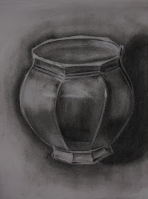
chalk pastels on black paper
I’m very pleased to be using the pastels. The black and white work was getting kind of dry. I do wonder, however, when we’re going to use our pencils. All the pencil work so far has been with plain old #2.
Note: this is part of the Basic Drawing Series.