Originally posted 5 August 2009.
We started with the black paper, using all our white media: chalk, charcoal pencil, chalk pastel, Conte crayon, Prismacolor pencil. The teacher gave us each a Xeroxed copy of a drawing of lilies. I really, really like the way mine turned out. I think it’s the best thing I’ve done by far this whole class.
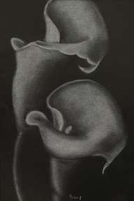
chalk, white Prismacolor, white chalk pastel, white charcoal, and white Conte crayon on black paper
Next we experimented with Fauvism and German Expressionism, which basically meant drawing familiar objects (in this case, tree trunks) using arbitrary color schemes. This was right up my alley, though my trees more resembled a Technicolor sea monster than anything in the botanical world. Most of my classmates colored their trees either red/orange/yellow or blue/purple with a contrasting background. My trees were pink/magenta/yellow/green and red/blue/turquoise with a gray/purple/magenta/turquoise background. My only “color scheme” was to use as many colors as humanly possible. It’s probably a good thing I don’t work in interior design.
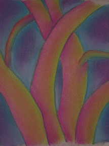
chalk pastel on newsprint
I finished my drawings way ahead of the rest of the class, meaning I had a lot of downtime last night. Even my lilies, which I fussed with far longer than I probably should have, were completed when others were barely past the outline stage. I twittered a somewhat disturbing metaphor that popped into my head: “If art were murder, my classmates would all be political assassins. I’d be a hit-and-run.”
Note: this is part of the Basic Drawing Series.
Leave a Comment