Tag Archives: torpedo factory

Basic Drawing: Finale

Originally posted 22 August 2009.

Since our final class was canceled, I opted for showing up this morning during my teacher’s painting class. I was the only one from Basic Drawing to show, so I felt a little out of place, but it was fun all the same. For our grand finale he let me choose my three-piece composition and materials. I went for a bottle, a vase, and a teapot, using chalk pastels on newsprint with an arbitrary color scheme. The colors I chose are such that no sane person would ever purchase in ceramic, but it was fun to use so many hues.

Since it was such a complex scene and my first time doing glass in color, it took me about three hours to complete. But I think I’m happy with it. It’s not my favorite (the lilies still win, and in fact are now framed), but it was a satisfying end to the course. I learned a lot in this class. I’d done a little noodling with pastels but I’d never even given any thought to charcoal or chalk. I had a great teacher and really enjoyed myself. The only thing I would have liked would have been to do more actual pen and pencil sketching. Perhaps next time.

chalk pastel on newsprint

And that’s it. I’ll take another class at some point. In the meantime, I’m thinking about getting some sort of tarp so I can use things like chalk and charcoal and pastels in my study without worrying too much about the white carpet.

Not that I have any clue what to do with my drawings. Most of them aren’t frame-worthy but I can’t bring myself to just toss them. So they’ll probably end up sitting in my closet. That’s okay. It was fun all the same.

Note: this is part of the Basic Drawing Series.

Basic Drawing #8

Originally posted 19 August 2009.

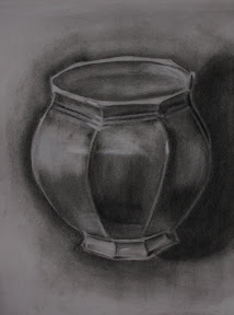
We started the evening with a bugger of a pot in charcoal on newsprint. Just a single pot, not a grouping, but even so it was interesting to compare to our drawings from the beginning of the class. With all the weird angles on this thing, I probably would have been crying had he introduced it weeks ago. I guess I have progressed somewhat.

charcoal on newsprint

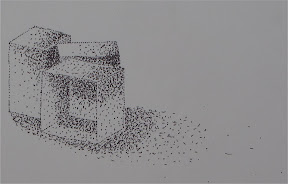
After that we (finally) used our pens a bit. We still haven’t used all those pencils we had to buy (4B, HB, et al), but at least we did have this one last hurrah with our Sharpies. We covered cross-hatching and stippling. The subject matter (boxes) was boring, but the technique was kind of fun. They involve pretty much what they sound like: cross-hatching is shading using overlapping lines, and stippling is shading with varying density of dots (similar to pointillism but in monochrome). My stippling kind of sucks – I was in too much of a hurry, creating more dashes than dots – but it turned out all right in the end.

ink pen on paper

He closed out the evening by giving us some suggestions for drawing experiments, such as sketching animals at the zoo or making clay models and then drawing them. He also assured me that the “old boys” (which is how he refers to various famous painters) drew from photographs, so I should never feel bad about it. :)

ink pen on paper

This was, for all extents and purposes, our last class. Our teacher has a conflict next week: he also teaches at NOVA, and for whatever reason the two overlap by a week this term. He did, however, give us three other options:

  1. Attend the Tuesday morning class. This would be an actual class, but it would mean taking leave from work.
  2. Attend the Saturday morning painting class. The teacher would be there and I wouldn’t have to use any time off, but it wouldn’t be a real class. Also, it would be pretty packed, meaning less personal interaction.
  3. Join him at the Hirshhorn Museum on Sunday afternoon. It’d be fun (and it’s my favorite Smithsonian), but I doubt much drawing would be involved.

I can attend any or all of them. I haven’t decided what I’ll do just yet. In the meantime, I think I’ll go ahead and scan/photograph all my drawings.

Note: this is part of the Basic Drawing Series.

Basic Drawing #7

Originally posted 12 August 2009.

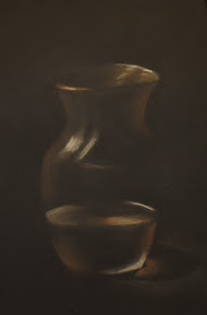
Last night we returned to monochrome to study glass. For our first piece, we started by covering the newsprint with black charcoal, smudging it up a bit with paper towel, and then using eraser and white chalk to draw the three glass vases. It was an interesting exercise, somehow different from starting with black paper. Dirty, too – at the end I had so much charcoal on my face I looked like I was in a production of Oliver! My super-talented Malaysian classmate commented that my one vase looked really transparent. That made me smile.

charcoal on newsprint

Despite the weirdness of the rolly carts and stools, The Torpedo Factory is actually a pleasant place to work. Our classroom overlooks the waterfront, and though the glass is frosted so you can’t see anything, you can hear the buskers all evening. Last night, one of them was playing the theme from The Good, The Bad, and The Ugly on panflute. Entertaining.

chalk on black paper

The second drawing was of a goblet, half full of water, with chalk on black paper. We were learning how much of the outline we could get away with leaving out without losing definition. A lot, as it turned out. The third drawing was similar, though this time it was of a larger vase of water, and we used red Conte crayon for the accents. I was especially pleased with how mine turned out.

chalk and red Conte crayon on black paper

When showing my husband my drawings this morning, I asked him if I could quit my job and play with chalk all day instead. I’m clearly better at it than sifting through the H.264 video compression standard. Alas.

Note: this is part of the Basic Drawing Series.

Basic Drawing #6

Originally posted 5 August 2009.

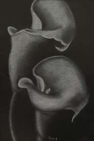
We started with the black paper, using all our white media: chalk, charcoal pencil, chalk pastel, Conte crayon, Prismacolor pencil. The teacher gave us each a Xeroxed copy of a drawing of lilies. I really, really like the way mine turned out. I think it’s the best thing I’ve done by far this whole class.

chalk, white Prismacolor, white chalk pastel, white charcoal, and white Conte crayon on black paper

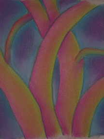
Next we experimented with Fauvism and German Expressionism, which basically meant drawing familiar objects (in this case, tree trunks) using arbitrary color schemes. This was right up my alley, though my trees more resembled a Technicolor sea monster than anything in the botanical world. Most of my classmates colored their trees either red/orange/yellow or blue/purple with a contrasting background. My trees were pink/magenta/yellow/green and red/blue/turquoise with a gray/purple/magenta/turquoise background. My only “color scheme” was to use as many colors as humanly possible. It’s probably a good thing I don’t work in interior design.

chalk pastel on newsprint

I finished my drawings way ahead of the rest of the class, meaning I had a lot of downtime last night. Even my lilies, which I fussed with far longer than I probably should have, were completed when others were barely past the outline stage. I twittered a somewhat disturbing metaphor that popped into my head: “If art were murder, my classmates would all be political assassins. I’d be a hit-and-run.”

Note: this is part of the Basic Drawing Series.

Basic Drawing #5

Originally posted 29 July 2009.

Last night’s class marks the halfway point for this course, and we finally started color. I actually own three sets of pastels, so rather than buying new, I brought them all to see which was the most applicable. This was a fortuitous decision on my part: our teacher specified chalk pastels, but the set I was originally going to bring was oil pastels. So I ended up using my great-grandmother’s set once again.

Our first drawing was of a sunset over mountains. This was strictly a “getting to know you” venture with the pastels, to use a large number of colors and see how they blend. Mine turned out okay, but just okay. After that we completed our “real” task for the night: flowers.
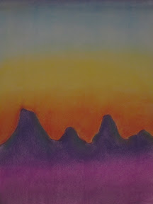
chalk pastels on newsprint

We’d been given an assignment last week to bring in pictures of Georgia O’Keeffe paintings and large-scale images of flowers. I went a little overboard with Google Images and brought somewhere around three dozen pages of print-outs. Turns out to have been a good thing I did: I think I was the only person in the class who remembered to bring in anything. The teacher was unexpectedly grateful when I told him he could keep the pictures. What am I going to do with them? And honestly, I can always just print them out again. Most of my classmates used a picture from the set I brought, so I was doubly pleased to have printed so many.

chalk pastels on newsprint

My sunset was done on my lap, but my flower was on the easel. They both have their benefits and drawbacks. On my lap, the pastel dust more or less stays put without any unintentional smearing, but leaning over the paper is uncomfortable, and I got a lot of pastel on my shirt to boot. The easel was cleaner from a laundry standpoint, but I kept having to blow away the dust as it slid down the paper so I wouldn’t accidentally mix it in the wrong places.

Overall, I think I prefer the easel for large-scale art (we were using the 18″x24″ newsprint pads again). I also discovered an unusual quirk with the easel. See, I am completely right-handed. Indeed, while recovering from carpal tunnel surgery I discovered I am all but helpless with my left hand. But when using a stick medium (chalk, charcoal, pastel, Conte crayon) on an easel, I use whichever hand is most convenient. I didn’t even realize I was doing it at first, but it’s sure (for the lack of a better term) handy.

oil pastels on black paper

The teacher used my drawing to demonstrate stuff to the class, meaning he completed the first two petals on my flower. This head start meant I finished my drawing long before the rest of the class (or maybe I’m just not as fastidious as they and rush my work, which is just as likely). With the extra time, I experimented with the other pastels I’d brought. I scribbled a quick flower with the oil pastels on black paper. It looked kind of nifty but was awfully dark – until the teacher showed me the sorcery of the white oil pastel. See, the white stick turns whatever color is underneath, allowing for better dynamic range for shading, and making the flower look amazing. Magic, I swear. My third set was pastel pencils, which I’d received as a gift. They’re simply chalk pastels in pencil form, presumably used for detail work. I scribbled another quick flower, using as many colors as possible, then blended it all together. It looks kind of interesting, but I think I’ll stick with the white paper for those.
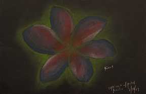
chalk pastels on black paper

I’m very pleased to be using the pastels. The black and white work was getting kind of dry. I do wonder, however, when we’re going to use our pencils. All the pencil work so far has been with plain old #2.

Note: this is part of the Basic Drawing Series.

Basic Drawing #4

Originally posted 22 July 2009.

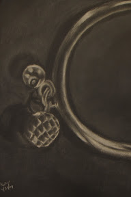
We continued the black paper work last night. First we used chalk and white charcoal pencil to draw a picture from a magazine. (We were supposed to finish the watches we started last week, but the teacher left that picture set at home.) A couple people drew more watches, but most of us drew shoes. I probably should have, but instead I got ambitious and grabbed a photo of a piece of jewelry with some sort of faceted bauble on the end. I think I bit off more than I can chew. My husband assured me that he could totally tell what it was, but I’m still convinced it more closely resembles a pineapple sans leaves.

chalk and white charcoal on black paper

That took most of the class, but in the last half hour or so we took our white Conte crayons out for a test drive to draw a lamp and a couple of roundish vases. Mine came out reasonably well despite the rush, perhaps because I moved back to the easel instead of having the sketchpad in my lap. Normally I’m fine with a sketchpad on a table in front of me, but the setup here is kind of unusual: there are rolly-carts, drawing boards, easels, stools, and folding chairs available. Most of my classmates balance their drawing boards between their rolly-carts and their laps, but I find my cart gets away from me too easily when I do that. That’s why I was using an easel in the first place. So when I wanted a different setup, I balanced the board with one end on the easel and the other in my lap. Whether I sat on the stool or the folding chair, my back started getting very stiff and sore. So I guess I’ll stick with an easel for the duration of this class. I just hope I don’t get dependent on it; I have absolutely nowhere to put one in my house.

white Conte crayon on black paper

Note: this is part of the Basic Drawing Series.
Basic Drawing #3

Originally posted 15 July 2009.

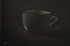
Tonight we used the black paper to draw a mug, a vase, and the beginnings of a watch. When our teacher was drawing the cup for us, I swear it was like black magic. He’d put some marks on the paper, smudge them a bit, and suddenly there was this cup there, complete with amazing shadows.

chalk on black paper

My cup turned out all right, though I wasn’t very happy with my vase. Symmetry is very difficult for me. It probably didn’t help that I was only using chalk, rather than white charcoal pencil. You can’t sharpen chalk.

chalk on black paper

Near the end of class, the teacher passed out photographs of watches (magazine ads) so we could work on drawing metallic glints. Mine looks ridiculous, but it’s also still only half done. I may be happier with it when I finish it next week. Drawing from photographs, though often maligned by “serious” artists, has helped me considerably in learning how to see properly. When we look at objects we’re familiar with, we often mentally fill in unseen details that we know are there, which often translates erroneously into our drawings. Photographs take all that away, so you can concentrate more on just the contours you can see.

chalk on black paper

The amount of embarrassing attention has been decreasing, much to my relief. One woman called me the “star of the class” – though to be fair, she wasn’t there last week. I prefer to just be part of the crowd when it comes to these sorts of things. I’m taking the class because I want to improve my drawing; if I was already good at it I wouldn’t need the class. :P

Note: this is part of the Basic Drawing Series.
Basic Drawing #2

Originally posted 8 July 2009.

We continued our experimentation with Conte crayon and charcoal last night (or char-kole, as it’s spelled on the package). The first was vases with charcoal. My drawing would have been quite true to life had I made these pots in my ceramics class a couple summers ago (that is to say, lumpy), and my attempts at shadows made the pottery look like it was on fire.

charcoal on newsprint

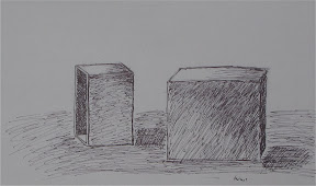
The next two drawings were of boxes: first with red Conte crayon and then with ink (i.e., Sharpie). The main lessons of the day were perspective and scale, neither of which I’m particularly good at, but my drawings were passable.

red Conte crayon on newsprint

The trouble with beginning art classes is that you necessarily start out with simple (and therefore boring) subjects. At least we haven’t been drawing produce. I really don’t like that. And I admit I kind of bristled when the teacher looked at my drawing and said, “Good job, as usual.”

Note: this is part of the Basic Drawing Series.
Basic Drawing #1

Originally posted 1 July 2009.

My first Basic Drawing class at The Art League was last night. I was almost late: I left work at 5:00 and between traffic and a stop at the supply store it was already 6:40 by the time I had a chance to get some dinner. The only quick place in sight was Starbucks, so I grabbed one of their weirdass sandwiches (tarragon chicken salad with cranberries) and a Naked-brand protein smoothie. The protein drink, chosen so my hands wouldn’t be shaky with hunger later, was gritty and unpleasant. But I drank it anyway. You can bet I’ll plan my time better next week.

We used our giant (18″x24″) newsprint pads exclusively last night. The only “tables” available were these crappy plastic rolly carts so I grabbed an easel. This was my first time using an easel, and it was certainly a different experience from a table or lap. I sat on a high stool for a while but eventually found it easier to just stand.

The first thing the teacher had us draw was our keys. He said he was going to just throw us into the pool and then tell us our mistakes afterward. We used a normal #2 pencil, then after however long we walked around and looked at everybody else’s drawings. There are some truly talented people in this class. And yet, the teacher chose my drawing to show the class as a really good example. I guess I should have suspected I was doing something right when he peeked at my work-in-progress and said, “You’ve drawn before.” But anyway, as he was teaching, he even said, “When I don’t have a [melydia] in this class I usually just draw it myself to demonstrate this concept.” So I was both flattered and embarrassed, as per usual when I receive unwarranted praise. It’s not like I was especially proud of this sketch, after all. It was just some big, weirdly out-of-perspective keys.

pencil on newsprint

But anyway. The next thing we did was draw the keys again, this time as an open composition (that is, part of the objects go off the side of the page, emphasizing the negative space). Since my first drawing was already an open composition (which was probably the main reason the teacher used it as an example), I went overboard and drew Giant Keys of Doom. Seriously: I drew two housekeys and both of them went off the side of the page in at least two directions. This second drawing was our first experiment with Conte crayons, which seem to be an intermediate step between Crayola and charcoal.

Conte crayon on newsprint

Our final drawing of the night (it’s a 2.5 hour class but the first part was spent on attendance, syllabus, and last-minute trips to the supply store) was of a vase, using charcoal. I was reasonably satisfied with how mine turned out, but I should have washed my hands in between drawings, or at least gotten some new paper towels. There were all sorts of bizarre and unintended streaks going on; it almost looks like my vase is coming apart at the edges. It’s like I’m a Surrealist and I didn’t even know it.

charcoal on newsprint

All in all it was a good class. I can see myself learning a lot, but even if I don’t, it’ll still be a nice structured environment forcing me to practice drawing more. So it’s win-win all around.

Note: this is part of the Basic Drawing Series.

Basic Drawing: Intro

I recently attended a Basic Drawing class at The Art League in Alexandria, Virginia, with Jim Burford. Over the course of the class, I’ve been doing weekly write-ups in my personal journal, which I have decided to repost here. It will be an accelerated overview, with one class per day instead of per week, and I will include the scans of the art I produced at each class. I also will edit the posts slightly to remove the boring stuff about my personal life. Trust me, it’s better this way.

The first post will be tomorrow. Afterward we will return to your regularly scheduled blog.

Table of Contents: Week 1 | Week 2 | Week 3 | Week 4 | Week 5 | Week 6 | Week 7 | Week 8 | Finale

© 2010-2024 kate weber All Rights Reserved -- Copyright notice by Blog Copyright