Tag Archives: art

Basic Drawing #4

Originally posted 22 July 2009.

We continued the black paper work last night. First we used chalk and white charcoal pencil to draw a picture from a magazine. (We were supposed to finish the watches we started last week, but the teacher left that picture set at home.) A couple people drew more watches, but most of us drew shoes. I probably should have, but instead I got ambitious and grabbed a photo of a piece of jewelry with some sort of faceted bauble on the end. I think I bit off more than I can chew. My husband assured me that he could totally tell what it was, but I’m still convinced it more closely resembles a pineapple sans leaves.

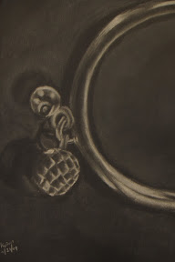
chalk and white charcoal on black paper

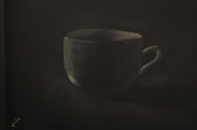
That took most of the class, but in the last half hour or so we took our white Conte crayons out for a test drive to draw a lamp and a couple of roundish vases. Mine came out reasonably well despite the rush, perhaps because I moved back to the easel instead of having the sketchpad in my lap. Normally I’m fine with a sketchpad on a table in front of me, but the setup here is kind of unusual: there are rolly-carts, drawing boards, easels, stools, and folding chairs available. Most of my classmates balance their drawing boards between their rolly-carts and their laps, but I find my cart gets away from me too easily when I do that. That’s why I was using an easel in the first place. So when I wanted a different setup, I balanced the board with one end on the easel and the other in my lap. Whether I sat on the stool or the folding chair, my back started getting very stiff and sore. So I guess I’ll stick with an easel for the duration of this class. I just hope I don’t get dependent on it; I have absolutely nowhere to put one in my house.

white Conte crayon on black paper

Note: this is part of the Basic Drawing Series.

Basic Drawing #3

Originally posted 15 July 2009.

Tonight we used the black paper to draw a mug, a vase, and the beginnings of a watch. When our teacher was drawing the cup for us, I swear it was like black magic. He’d put some marks on the paper, smudge them a bit, and suddenly there was this cup there, complete with amazing shadows.

chalk on black paper

My cup turned out all right, though I wasn’t very happy with my vase. Symmetry is very difficult for me. It probably didn’t help that I was only using chalk, rather than white charcoal pencil. You can’t sharpen chalk.

chalk on black paper

Near the end of class, the teacher passed out photographs of watches (magazine ads) so we could work on drawing metallic glints. Mine looks ridiculous, but it’s also still only half done. I may be happier with it when I finish it next week. Drawing from photographs, though often maligned by “serious” artists, has helped me considerably in learning how to see properly. When we look at objects we’re familiar with, we often mentally fill in unseen details that we know are there, which often translates erroneously into our drawings. Photographs take all that away, so you can concentrate more on just the contours you can see.

chalk on black paper

The amount of embarrassing attention has been decreasing, much to my relief. One woman called me the “star of the class” – though to be fair, she wasn’t there last week. I prefer to just be part of the crowd when it comes to these sorts of things. I’m taking the class because I want to improve my drawing; if I was already good at it I wouldn’t need the class. :P

Note: this is part of the Basic Drawing Series.

Basic Drawing #2

Originally posted 8 July 2009.

We continued our experimentation with Conte crayon and charcoal last night (or char-kole, as it’s spelled on the package). The first was vases with charcoal. My drawing would have been quite true to life had I made these pots in my ceramics class a couple summers ago (that is to say, lumpy), and my attempts at shadows made the pottery look like it was on fire.

charcoal on newsprint

The next two drawings were of boxes: first with red Conte crayon and then with ink (i.e., Sharpie). The main lessons of the day were perspective and scale, neither of which I’m particularly good at, but my drawings were passable.

red Conte crayon on newsprint

The trouble with beginning art classes is that you necessarily start out with simple (and therefore boring) subjects. At least we haven’t been drawing produce. I really don’t like that. And I admit I kind of bristled when the teacher looked at my drawing and said, “Good job, as usual.”

Note: this is part of the Basic Drawing Series.

Basic Drawing #1

Originally posted 1 July 2009.

My first Basic Drawing class at The Art League was last night. I was almost late: I left work at 5:00 and between traffic and a stop at the supply store it was already 6:40 by the time I had a chance to get some dinner. The only quick place in sight was Starbucks, so I grabbed one of their weirdass sandwiches (tarragon chicken salad with cranberries) and a Naked-brand protein smoothie. The protein drink, chosen so my hands wouldn’t be shaky with hunger later, was gritty and unpleasant. But I drank it anyway. You can bet I’ll plan my time better next week.

We used our giant (18″x24″) newsprint pads exclusively last night. The only “tables” available were these crappy plastic rolly carts so I grabbed an easel. This was my first time using an easel, and it was certainly a different experience from a table or lap. I sat on a high stool for a while but eventually found it easier to just stand.

The first thing the teacher had us draw was our keys. He said he was going to just throw us into the pool and then tell us our mistakes afterward. We used a normal #2 pencil, then after however long we walked around and looked at everybody else’s drawings. There are some truly talented people in this class. And yet, the teacher chose my drawing to show the class as a really good example. I guess I should have suspected I was doing something right when he peeked at my work-in-progress and said, “You’ve drawn before.” But anyway, as he was teaching, he even said, “When I don’t have a [melydia] in this class I usually just draw it myself to demonstrate this concept.” So I was both flattered and embarrassed, as per usual when I receive unwarranted praise. It’s not like I was especially proud of this sketch, after all. It was just some big, weirdly out-of-perspective keys.

pencil on newsprint

But anyway. The next thing we did was draw the keys again, this time as an open composition (that is, part of the objects go off the side of the page, emphasizing the negative space). Since my first drawing was already an open composition (which was probably the main reason the teacher used it as an example), I went overboard and drew Giant Keys of Doom. Seriously: I drew two housekeys and both of them went off the side of the page in at least two directions. This second drawing was our first experiment with Conte crayons, which seem to be an intermediate step between Crayola and charcoal.

Conte crayon on newsprint

Our final drawing of the night (it’s a 2.5 hour class but the first part was spent on attendance, syllabus, and last-minute trips to the supply store) was of a vase, using charcoal. I was reasonably satisfied with how mine turned out, but I should have washed my hands in between drawings, or at least gotten some new paper towels. There were all sorts of bizarre and unintended streaks going on; it almost looks like my vase is coming apart at the edges. It’s like I’m a Surrealist and I didn’t even know it.

charcoal on newsprint

All in all it was a good class. I can see myself learning a lot, but even if I don’t, it’ll still be a nice structured environment forcing me to practice drawing more. So it’s win-win all around.

Note: this is part of the Basic Drawing Series.

Basic Drawing: Intro

I recently attended a Basic Drawing class at The Art League in Alexandria, Virginia, with Jim Burford. Over the course of the class, I’ve been doing weekly write-ups in my personal journal, which I have decided to repost here. It will be an accelerated overview, with one class per day instead of per week, and I will include the scans of the art I produced at each class. I also will edit the posts slightly to remove the boring stuff about my personal life. Trust me, it’s better this way.

The first post will be tomorrow. Afterward we will return to your regularly scheduled blog.

Table of Contents: Week 1 | Week 2 | Week 3 | Week 4 | Week 5 | Week 6 | Week 7 | Week 8 | Finale

Hobbies ahoy!

I can never turn down an opportunity to write lists, so I’ve added a more fleshed-out hobbies page, complete with a list of my wild catches from BookCrossing.

I’ve also added a couple more sites to the Writing Prompts Websites list, but I won’t make a separate post every time I do that.

In sadder news, my softshell turtle Matey died yesterday, so I’ve updated the about section accordingly.  I’ll miss that ugly little turtle.

PostSecret

PostSecret: An online art project in which people send in postcards with a secret on it and the better ones are posted on this blog. Most of them are very sad and yet I can’t stop reading.

© 2010-2025 kate weber All Rights Reserved -- Copyright notice by Blog Copyright