I don’t mean that quite the way it sounds. I learned this technique from my second Basic Drawing course at The Art League. The idea is twofold:
- When drawing something with defined corners or parallel lines, turn it upside down to check your angles.
- When drawing from a photograph or other movable object, turn it upside down and draw it that way.
The first notion is excellent for drawing things like cubes. I fixed many a wonky corner by turning it upside-down and giving it another look. I have absolutely no idea why this works. Shouldn’t parallel lines look just as (in)correct from any angle?
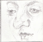
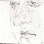
For the second one, the purpose is to remove your preconceived notions about what something is supposed to look like in order to concentrate on the shapes you are reproducing. This is actually a very good idea, especially when working with human figures, but I’ve found that sometimes very strange things occur. For example, these two drawings are of the exact same thing, except one was turned upside-down:
(Click on the images for larger versions.)
I have no idea what was going on here. I don’t have the original to share with you, which is probably better for my ego, but it was a fairly generic etching of a woman. I put a “viewing box” (that is, a piece of cardboard with a square hole cut in the middle) to define what part of the image I was going to draw. So I know these were of the same section of the same image. I dunno.
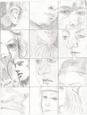
The rest of the turned out okay.
I like copying, but sometimes I wish I could create things like this from my imagination.
I suspect turning things upside-down helps with parallels and corners for the same reason as faces and landscapes: your brain wants things to fit certain patterns so it “fixes” wonky corners and not-quite-parallel lines so they look as they’re supposed to. Those drawings are cool. Can you remember which one looked more like the original? I assume the second is the one that was done upside-down.
I think it’s pretty impressive you can do this at all, regardless of whether you’re working from a photo or your imagination. Even from a picture – a picture OF A DRAWING – I have tremendous difficulty with shading. I especially like the first one in the third row.
I don’t recall which looked more like the original, actually. Probably the right-side-up one, actually, though I do find it interesting how similarly the noses turned out.
It’s funny you should point out the first one in the third row. All the rest were etchings or drawings; that was one a photograph of a statue.
Thanks for the encouragement!